
Project Overview
Fashion relies on emotional purchases, unlike the functional, specification-driven purchases in hardlines. Flipkart, as a horizontal platform, scaled through standardized systems like fixed schema definitions, basic catalog inputs, and image guidelines. This approach posed long-tail discovery challenges and made the fashion category appear indistinguishable from other products on the platform.
My Role
Category UX Head
Type
End-to-end Mobile App
Collaborators
- Product Managers
- Business Heads
- Tech Partners
- UX Designers
- Catalog Leads
The Problem
- Manual cleanup of input variables in catalog backend
- Lack of integration between search, browse, and recommendation systems
- Hindered user context recognition and journey personalization
The Goal
- Enable intuitive contextual discovery of selection
- Provide addictive browse experience
- Alleviate user pain points
- Ensure seamless checkout process
Project Introduction
India’s internet penetration soared from 14% in 2014 to 52% in 2024, presenting a significant growth opportunity for softline categories, which previously contributed just 5% to our GMV. With strategic scaling, we aimed to extend online shopping benefits to 200 million more customers, becoming the top destination for fashion shoppers.
Information Architecture

Lofi Wireframes
Focus on Imagery
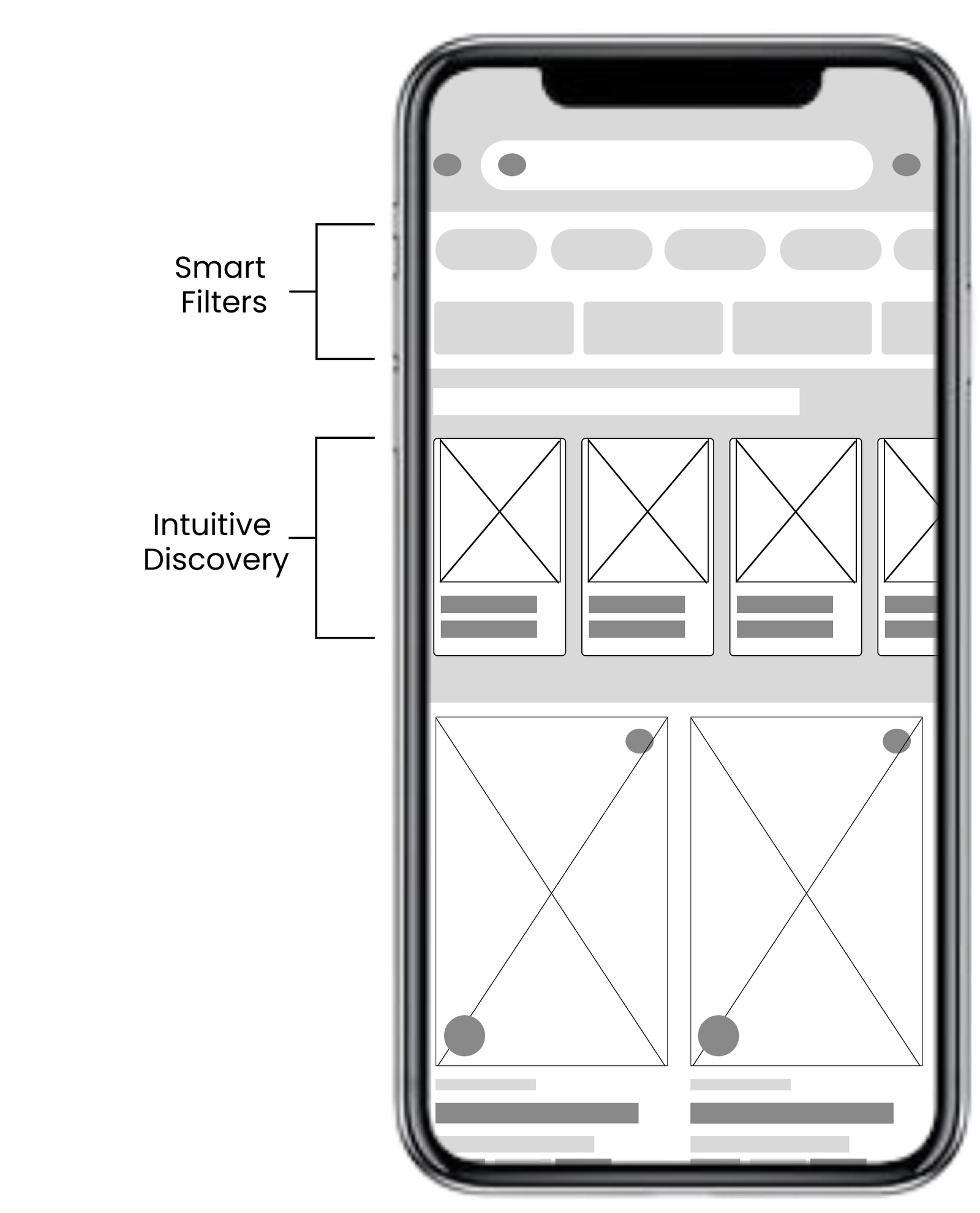
Intuitive Shortlisting
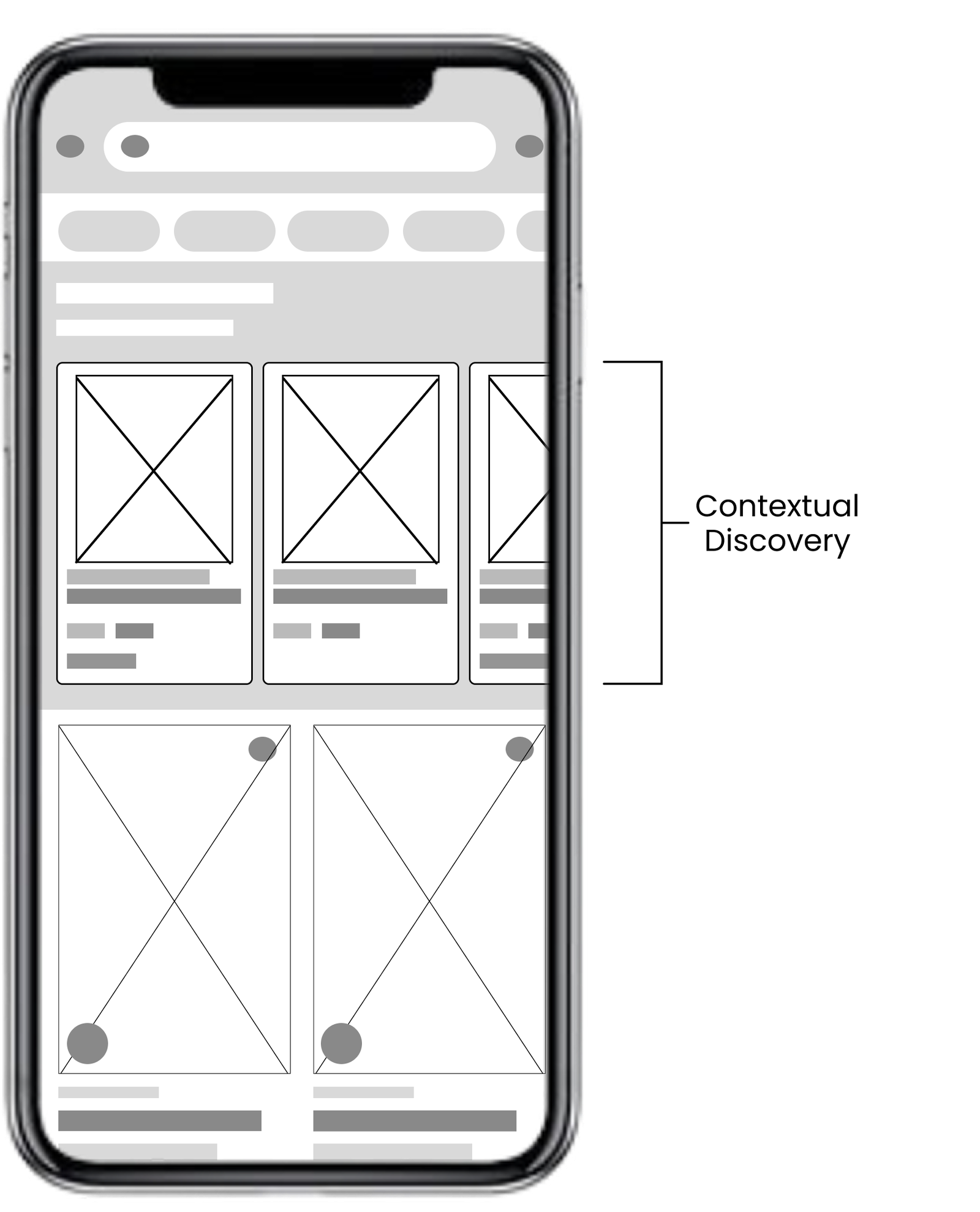
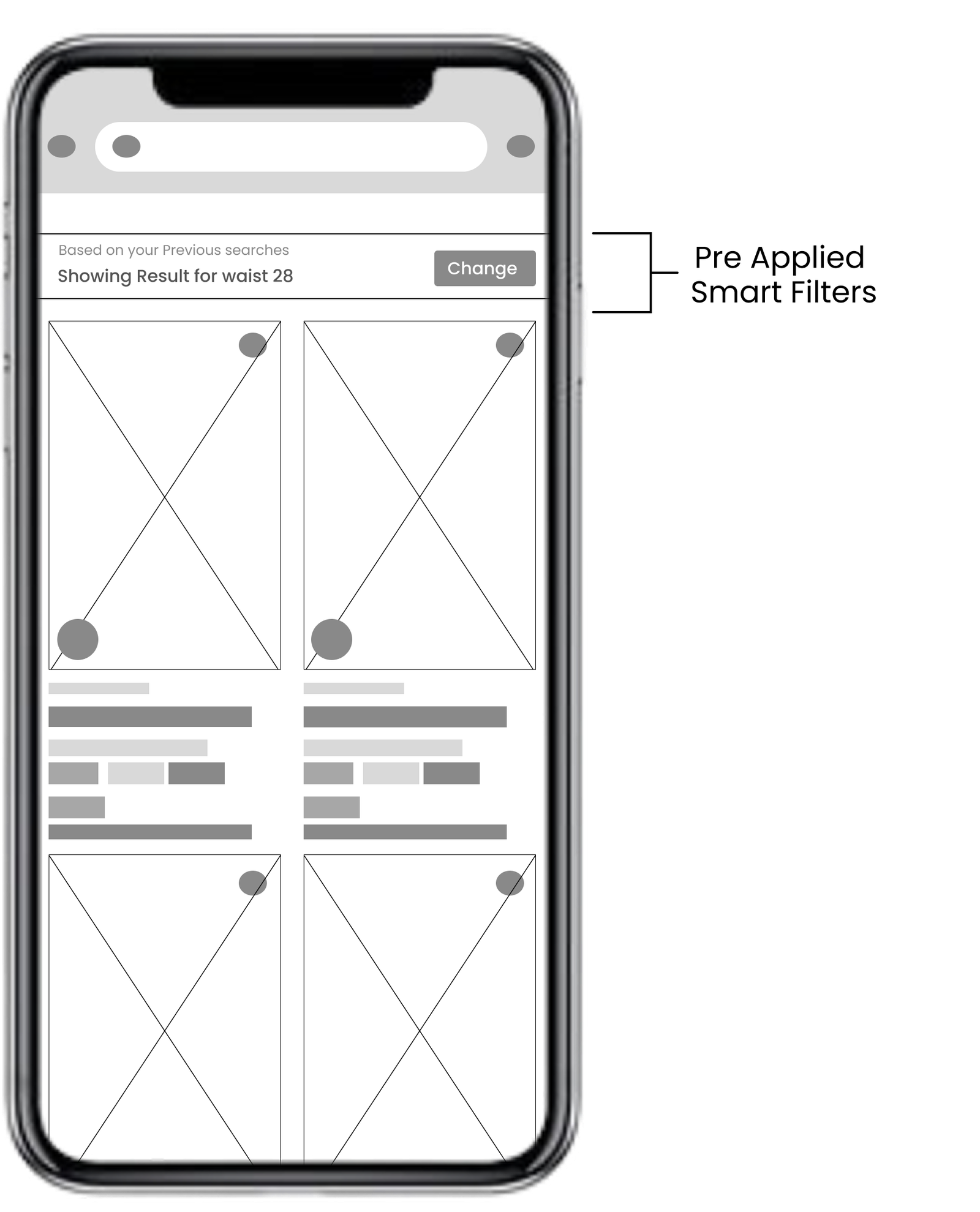
In-feed & pre-applied filters
Final Output
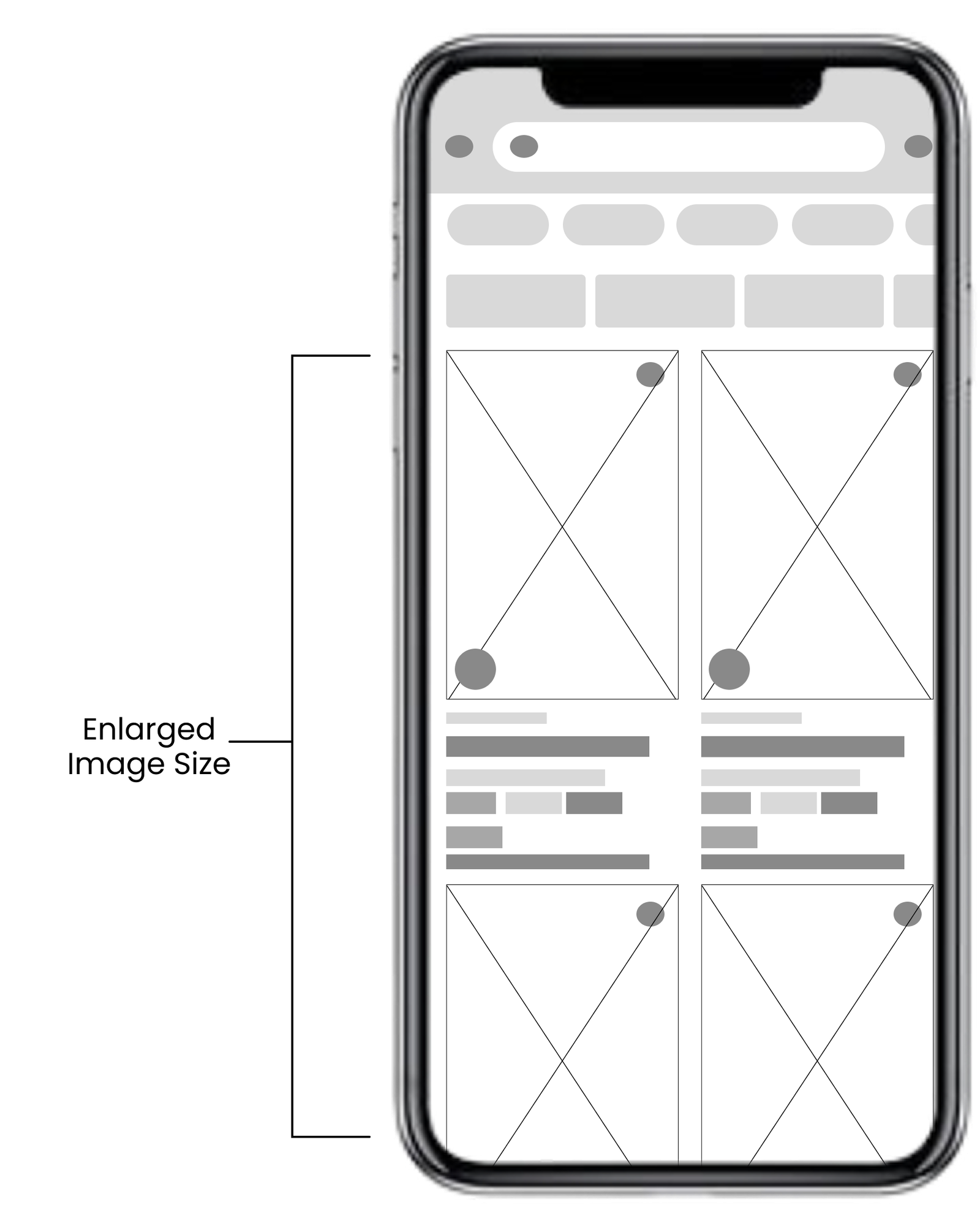
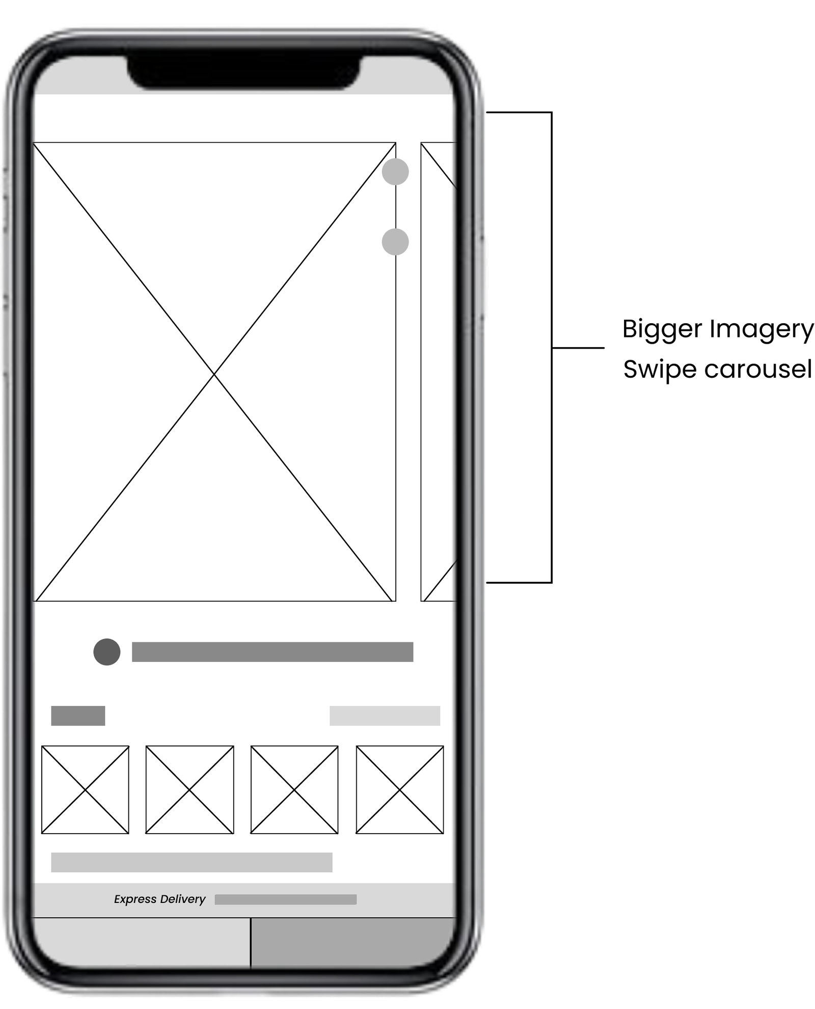
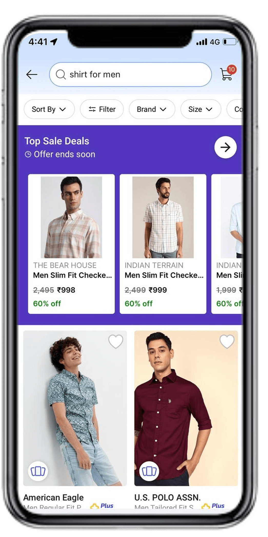
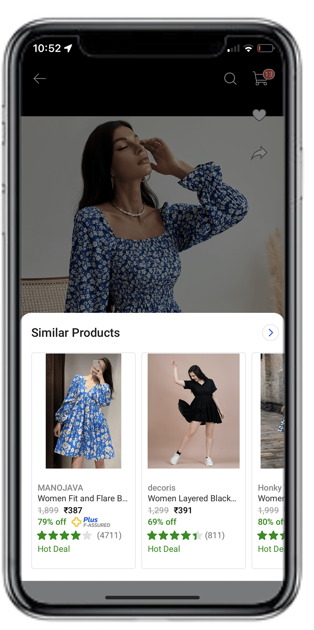
Imagery Enhancement In Search Browse
Authored a new cohort-based fashion playbook for cataloging. Increased the size of imagery in browse and PP. Gallery scroll view on PP along with videos.
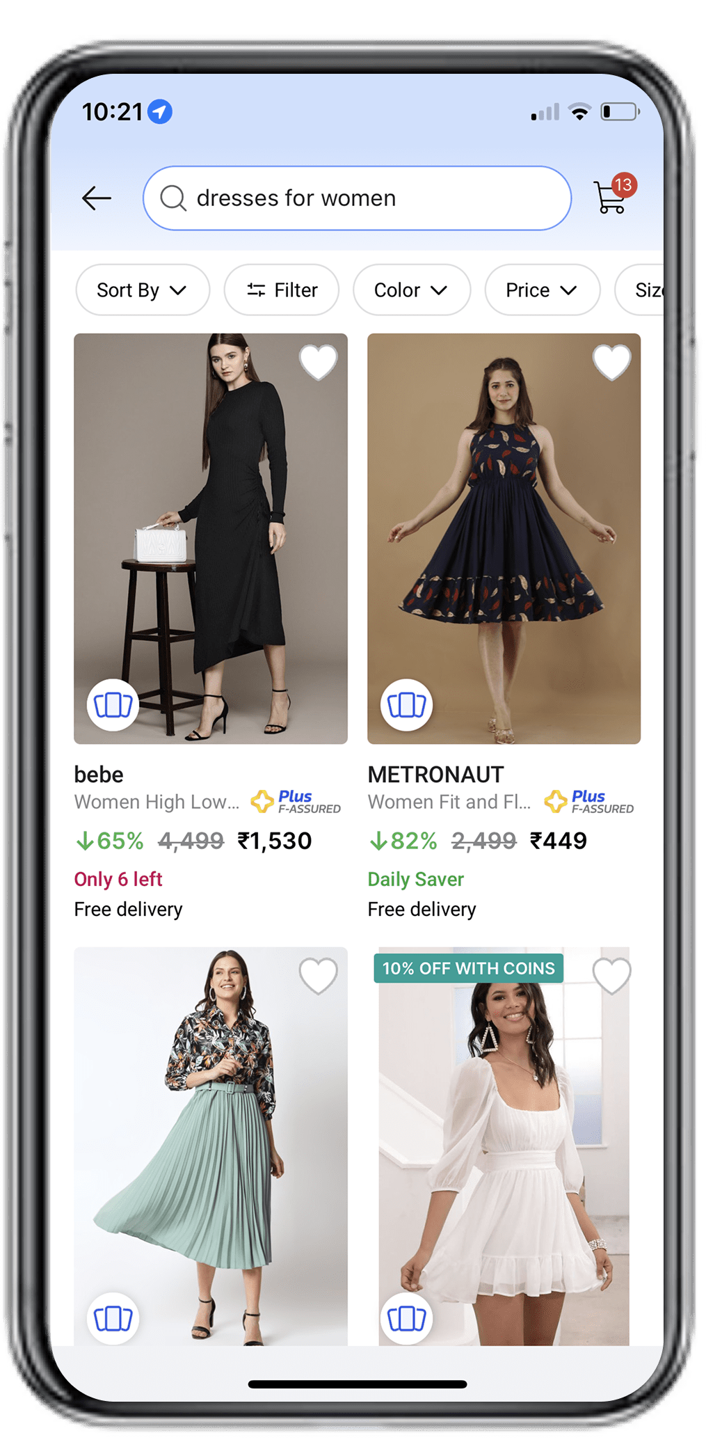
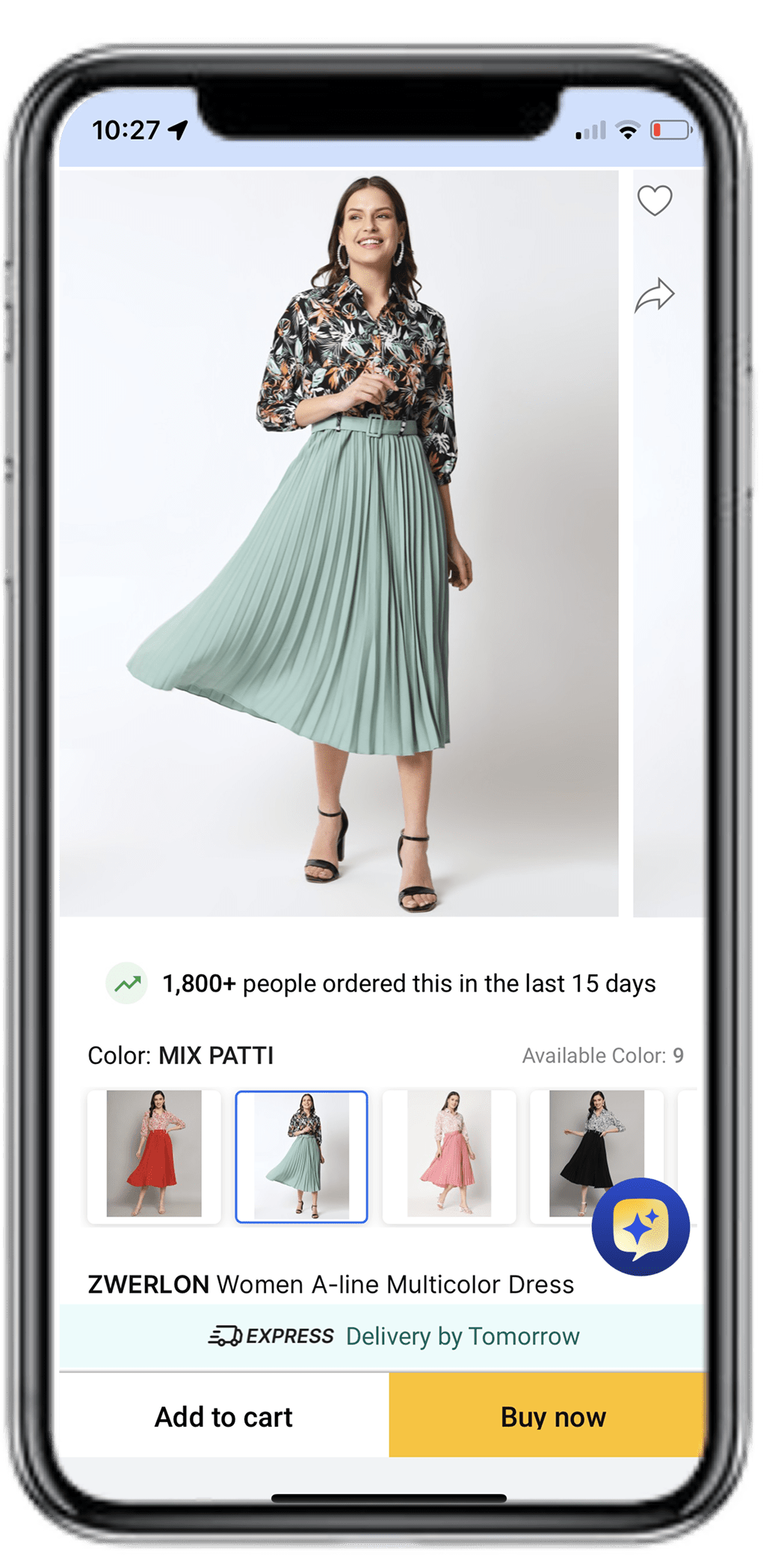
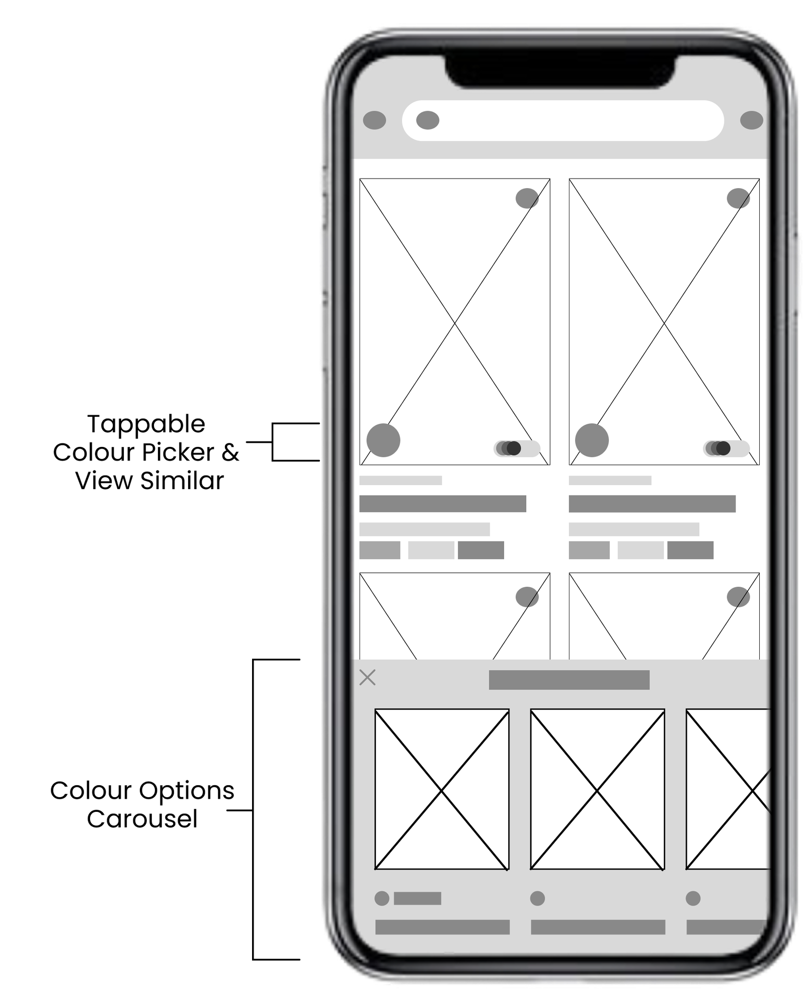
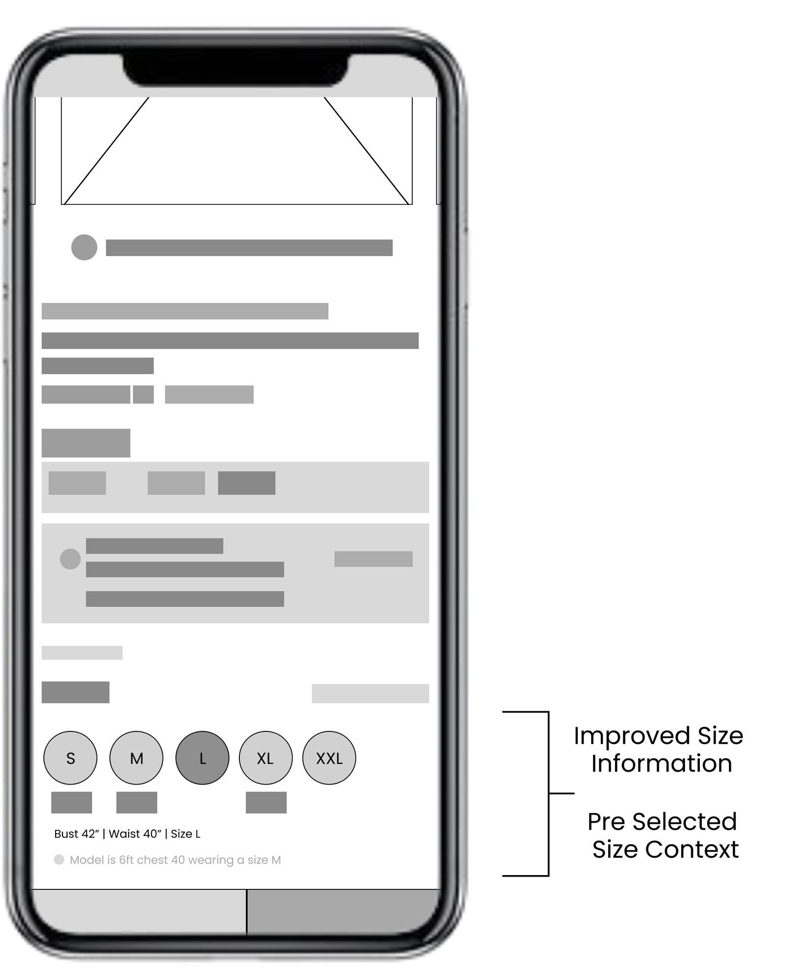
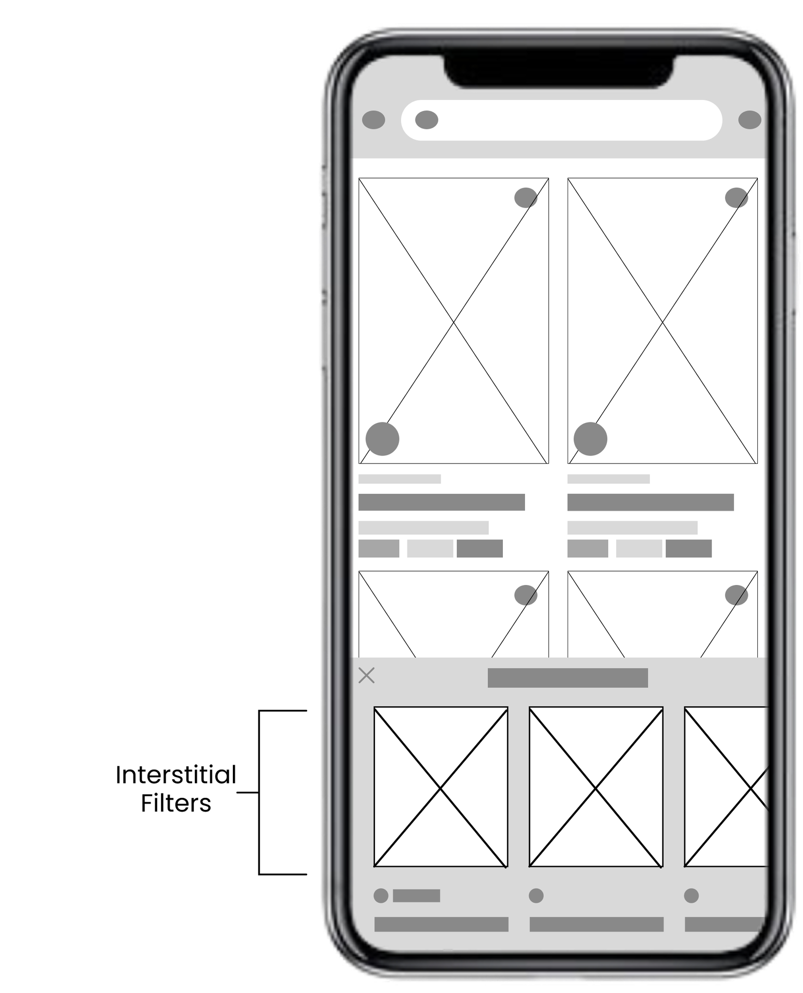
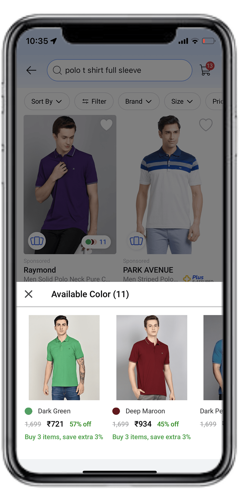
Intuitive Shortlisting
Tappable colour picker with interstitial pop-up in browse. Redesigned the size feature to be intuitive and informative. Overall information hierarchy reworked.

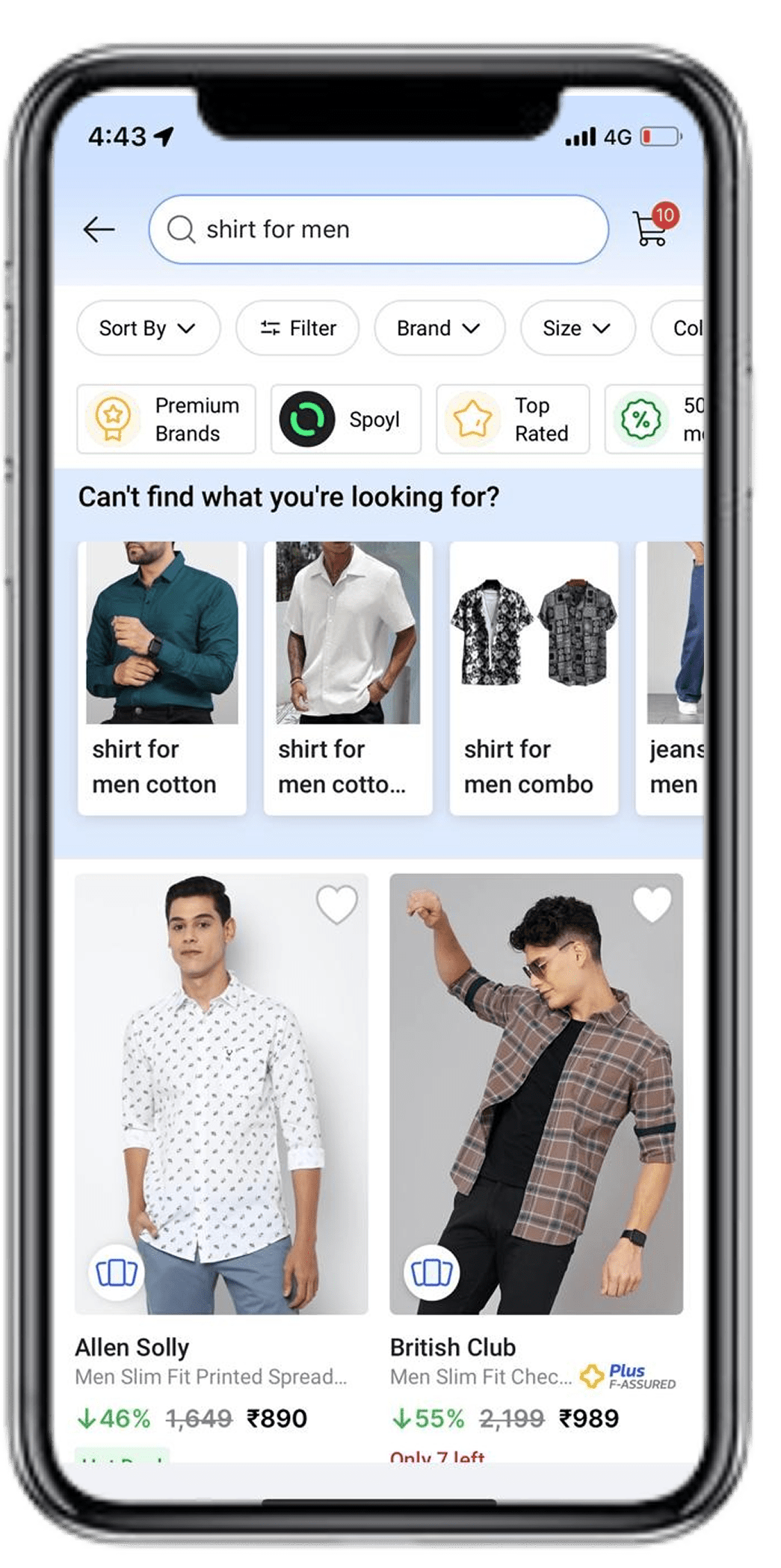
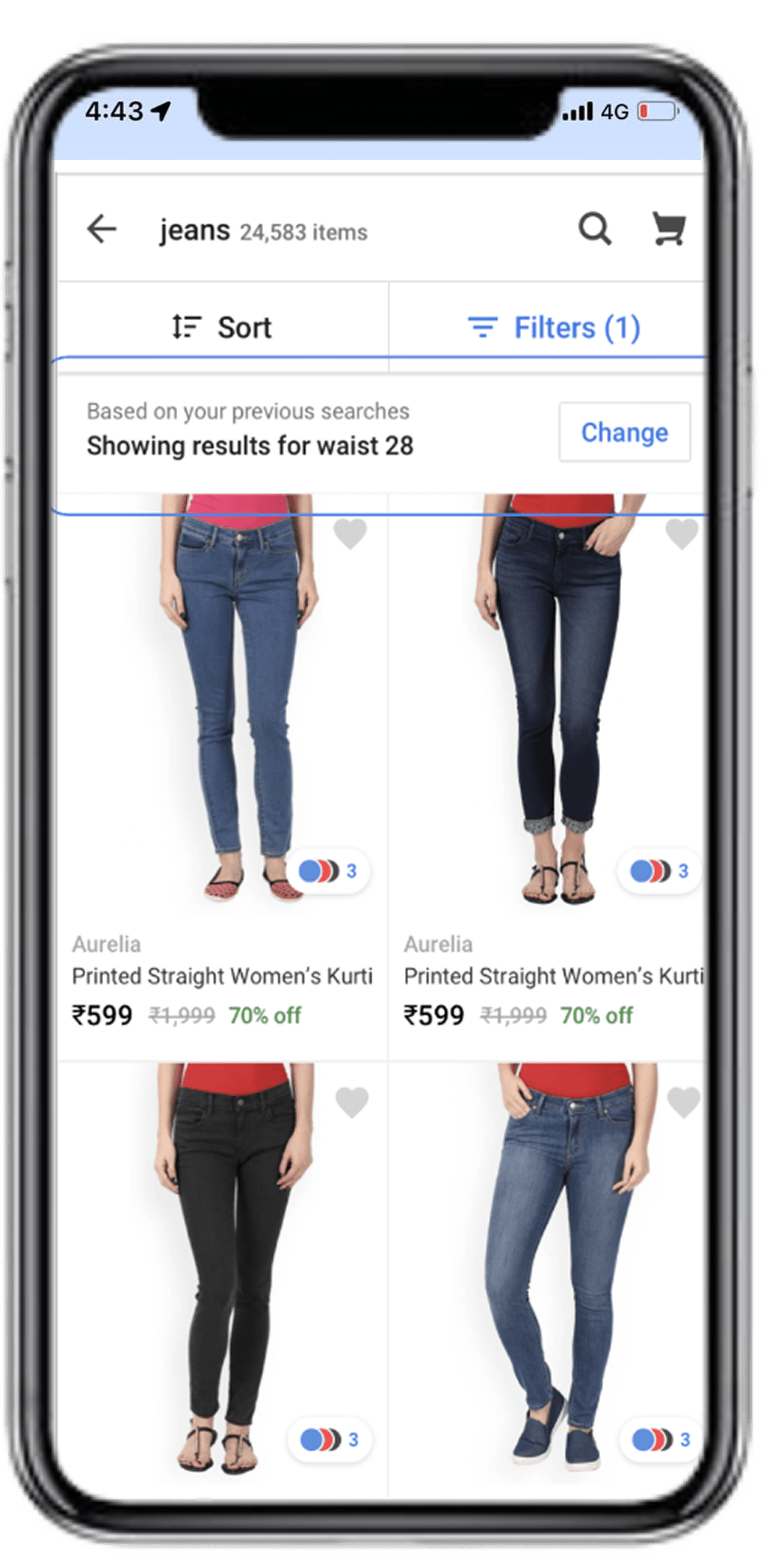
In-feed & pre- applied filters
Designed merch-like scroll widgets in browse for contextual discovery and consistency in UX. Designed smart filter experience with tappable popular filters upfront on browse. Pre-selected size filter highlighted.
Usability Testings
Key Sightings
- Inconsistent imagery and catalog info
- Lack of trust in product quality
- Platform not responsive to user intent
Key Solves
- Catalogue enrichment ecosystem
- Better imagery and brand content
- Progressively Responsive user journey
Impact
